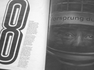
I’ve got mixed feelings about Audi’s indulgent piece celebrating their win at Le Mans.

Grainy-looking black and white photography (rubber streaked tarmac has never looked so sexy), oodles of fancy typography and hectares of empty space – you’d think we’d time-slipped back to the sixties when companies weren’t so afraid of using ‘art’ as a marketing tool.
Part of me wants to congratulate Audi in having the nerve to produce this item. It must have cost them a fat wedge – although nothing compared to the bill for developing and running three competitive Le Mans cars. But the other half of me (the bitter half that is), gets a bit warm under the collar at the way they’ve mistreated the copy.
The words themselves are actually rather good. All copywriters think they can do better than the other guy and I’m no exception, but I think the credited writer, Mike Duff, has done a fine job. My personal red mist began to form when I opened the cover and saw the typesetting and layout on the first double page.
In short, the text was too wide, too bold, too big and too blocky. Consequently, I found it too difficult to read. I turned the page and found the designer had now set the body copy in a smaller display face with a line running through it to make the letters even more illegible.
This sin was then compounded throughout the supplement with each block of text being artfully squished and/or rendered in a multitude of faces. I’m sure some designers would say this was being brave and I’m all for breaking with convention – but not if this means making the thing unreadable.
The moral? Designers should try reading the text they’re working with after they’ve positioned it in their design, and preferably in the form and size in which the final product will be released. An image on paper is very different from the same image displayed on the designer’s screen, and this alone can create a whole stack of problems.
Above all, designers should remember that words aren’t just panels of greyish, squiggly-textured fill that have to be grudgingly accommodated; they have an essential part to play and it’s the designer’s job to help them do it. Of course, copywriters aren’t exactly blameless either – but more on that another time.